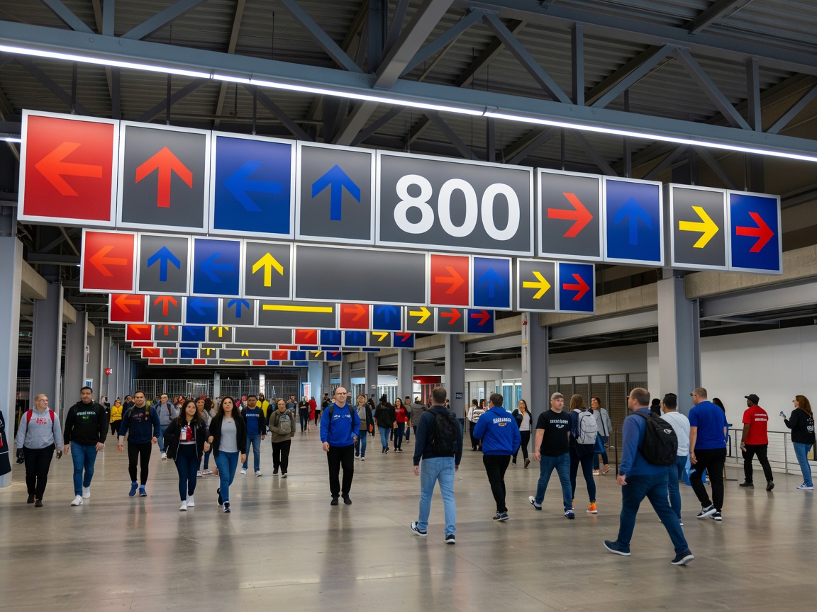
Build a hierarchy
Visitors need information in an order. Arrival points establish the venue. Entrance signs identify the correct access. Directional signs support the next decision. Gate, sector and block information then narrows the route.
A hierarchy prevents every panel from competing for attention. Primary destinations should be visually stronger than supporting instructions. Repeated information should use the same words and visual treatment.
Map arrival and decision points
Begin with the movement paths between transport arrival, parking, security, ticket checks, entrances, concourses and seats. Mark points where a visitor must choose a direction. These are the locations where information has the highest operational value.
Do not place signs only where there is spare wall space. A sign should be visible before the decision, not after it. Check sightlines, competing messages, crowd density and lighting during planning.
Arrows and route language
Directional arrows should be consistent in shape, scale and meaning. Route language should match the venue's terminology. If one area uses “Gate 3” and another uses an unexplained abbreviation, the system becomes harder to scan.
Zone numbering can support orientation when it is logical and repeated. It should connect with maps, ticket information, digital instructions and entrance identification where those channels exist.
Concourse navigation
Concourse routes often contain repeated junctions. A visitor may need confirmation after turning, not only an arrow at the initial decision. Reassurance signs can repeat the destination and identify the next zone without adding unnecessary copy.
Maps are useful when the structure is complex. They should show the reader’s position, key destinations and a readable “you are here” relationship. A map that contains every operational detail may be accurate but difficult to use.
Consistency across venue areas
Outdoor approaches, hospitality zones, general admission routes and accessible routes may have different conditions. They still need a shared visual language. Record terminology, colours, arrow rules, icon use, type hierarchy and sign families in a system schedule.
The advantage of a system is continuity. The limitation is that it requires more planning than selecting signs one location at a time. That planning protects the visitor experience as the venue changes.
Checklist
- Map arrival routes and every major decision point.
- Define destination hierarchy and repeated terminology.
- Test arrows, sightlines, maps and reassurance points.
- Coordinate physical and digital information where applicable.
What to know
Wayfinding works when information arrives before the decision, repeats when useful and remains consistent across the complete route.